
User-friendly means a payment page is designed to be fast, easy, and accessible to your clients and have the necessary information to complete their transactions. It is also essential that you provide compensation options that are flexible enough to suit your customers’ needs.
How to Find out if your payment page is user friendly
Ask your customers what they think
You can ask them their thoughts by asking them to fill out a short survey. The survey will ask about their experience with the site and if they found it easy to use.
You don’t have to wait for someone to complain about your payment system—there are plenty of places online where people can leave feedback on websites. This can help you make improvements that will improve the user experience of your site and its functionality.
Compare your payment page to other similar payment pages
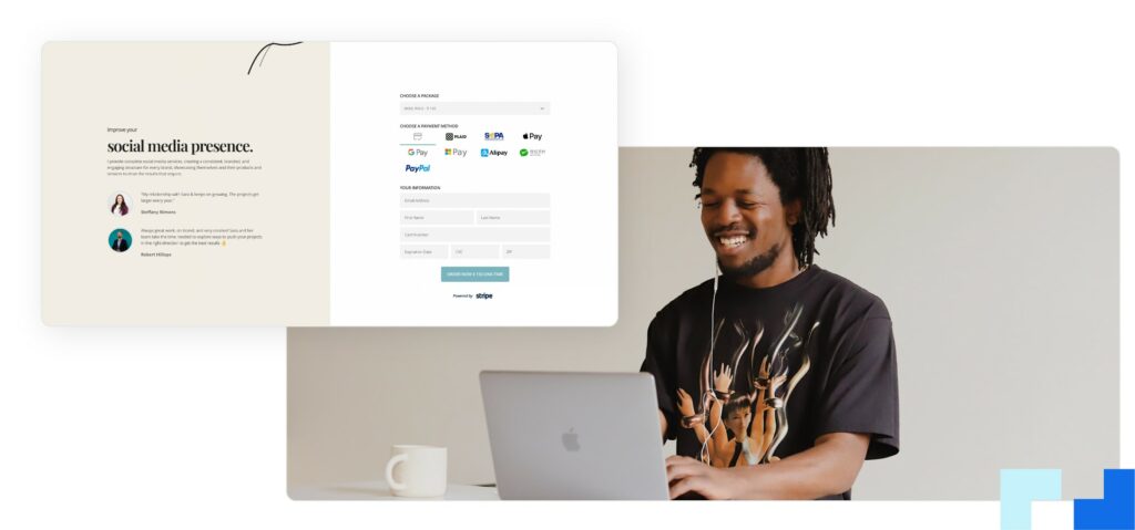
Provide a transparent header for your payment form
To make sure your payment form is user-friendly, you need to provide a transparent header for your form. Here’s how:
- Add a clear title to the top of your page. This will tell people what they agree to when they click on the link to pay for goods or services.
- Include a visible button that says “Pay Now,” “Continue Shopping,” or something similar in large, bold letters so that people can pay more easily without having to scroll down the page first.
- If possible, use color contrast to highlight essential elements of the form (like buttons) so that they stand out among other elements on the page—this will make it easier for users to find what they’re looking for and click on it quickly.