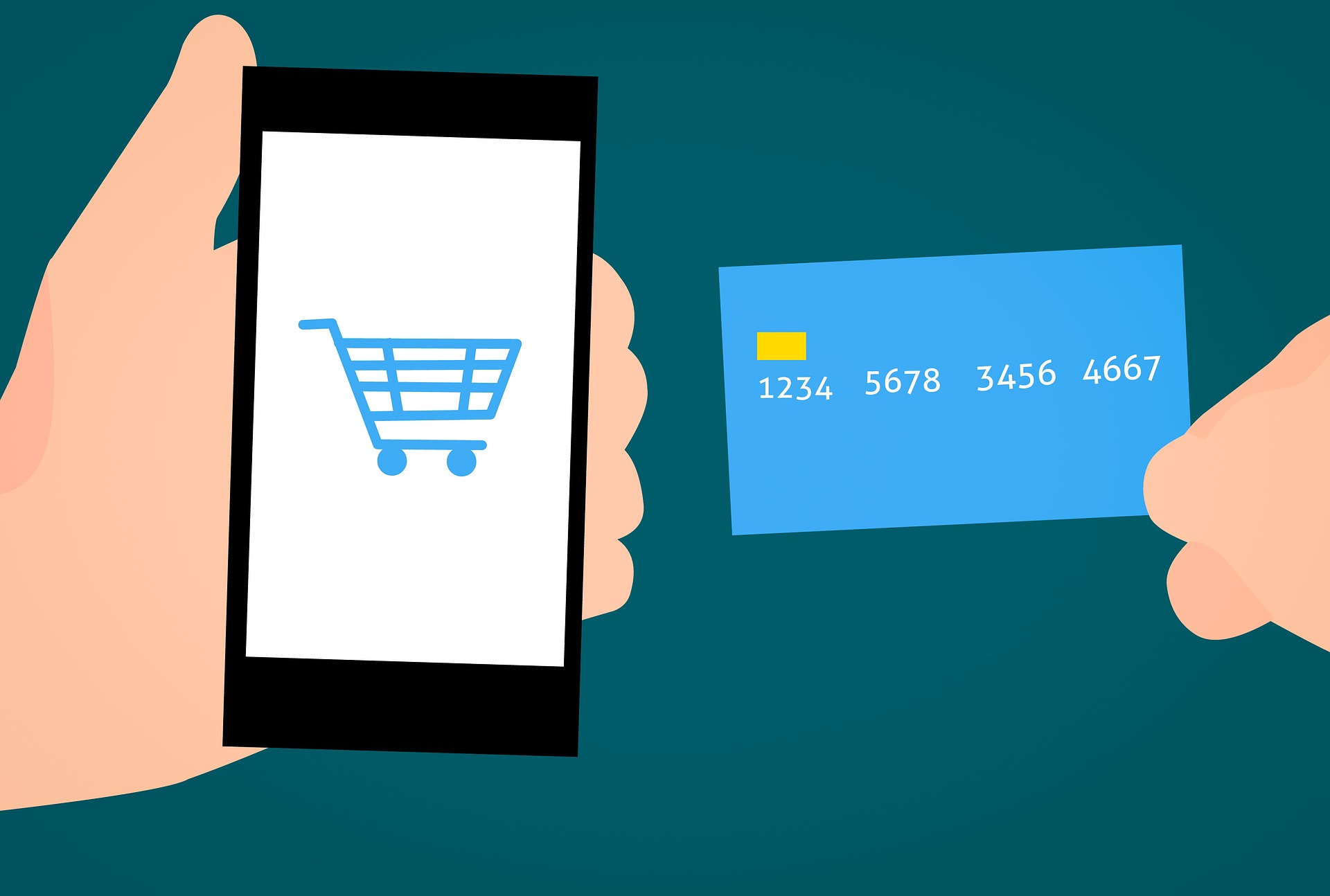
With the majority of business now being conducted online, it is important for every business to have an online presence. While this does make things more convenient for the average consumer, this makes things far more competitive for businesses of all sizes, in all industries.
For a business to have that competitive advantage online, it must achieve quite a few things. It must have a robust and recognizable brand, it must have good social media practices, and its website must provide a good experience for the user. In this article, we are going to talk about the user experience. In particular, we will go over how your payment process can affect it.
To that end, here are 4 common mistakes online businesses make when designing their payment process, and the ways to fix them:
1. No mobile checkout
Gone are the days when most users were on laptops. Nearly 60% of internet users in the modern age use their smartphones to make online purchases. That means your mobile interface is more of a priority than ever, including your payment process or stripe checkout process.
One of the easiest ways to fix this is through the use of a hosted payment page. It is also important to test your website on a mobile device to see how well it looks and how easily it is navigated on a smaller screen.
2. No guest checkout
Not everyone who goes to your website wants to make an account. Some enjoy guest checkout because the process of filling out a form might take too long, and others might have security concerns. Whatever the reasoning might be, not allowing guest checkout might just turn them off from a purchase entirely. While having that important user data is important, it is still more important to prioritise profit.
This is relatively easy to fix, as it involves incorporating a checkbox that allows users to skip your user data form. A hosted payment form is also a perfect thing to add.
3. Too many clicks
Your website must take the fewest clicks possible from your landing page to your stripe checkout. This is the reason why Amazon has a 1-click checkout option, and why so many e-commerce websites have a “Buy Now!” button next to their “Add to cart.” The faster your users and customers can pay and get their order confirmed, the more likely you are to successfully sell them things.
4. Surprise costs
One of the major reasons for abandoned carts on e-commerce websites is surprise costs. If your shipping and handling costs appear at the end of the payment process, it might prove dangerous for your e-commerce website. Any surprise costs might scare off potential customers, so it is important to give them an idea of the cost of their shipping and handling as they continue to shop.
Another good solution is to offer promotions of free shipping and handling once a certain purchase total has been achieved.
Final thoughts
The user experience is one of the most important considerations in the design of a website. Your payment process is no exception to this. Even with all the information a customer has to provide, it must be as convenient as possible for them to make a purchase. This can improve your bottom line and elevate your profits.
If you’re looking for a hosted payment page service, send us at Payment Page a message. We have the skills to make this easier for both you and your customers.


